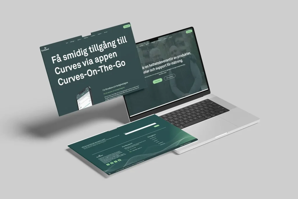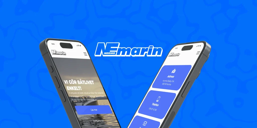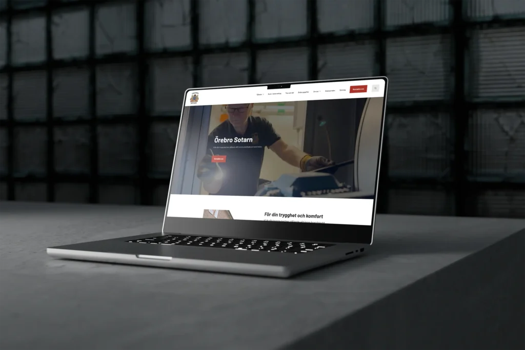


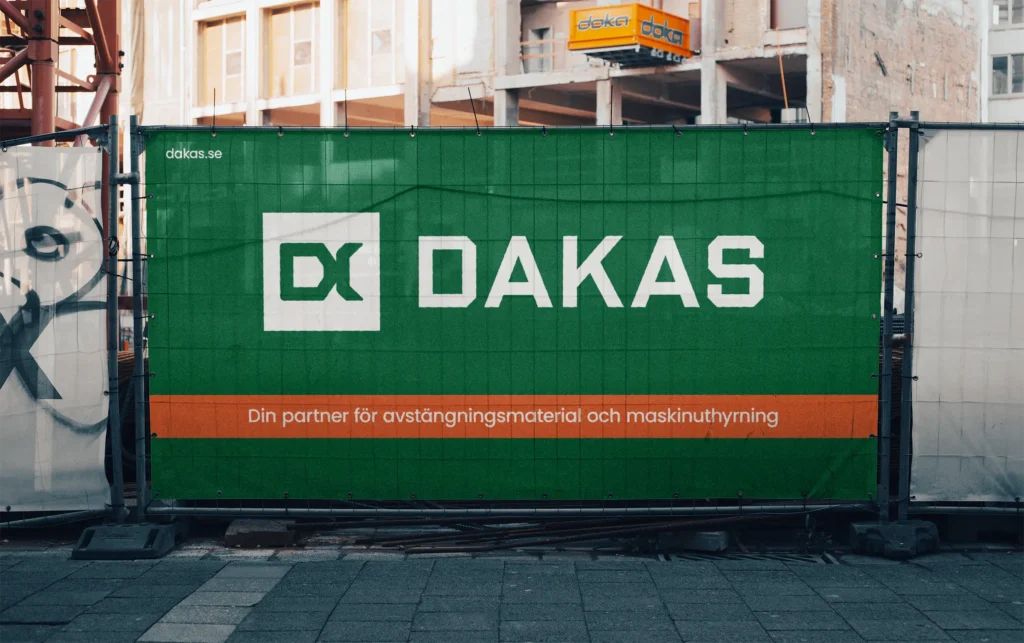
Choosing the right font is crucial for a graphic profile and website. Fonts not only convey information, they also set the tone and create a feeling that affects how your brand is perceived. The fonts you choose convey a certain feeling to your audience. You can change the whole look and feel of your brand by switching fonts.
Finding the perfect combination of fonts can be overwhelming as there are so many fonts available. But with a few basic elements, the choice becomes easier.
- What feeling do you want to convey? Do you want to show that you are modern and minimalistic, playful and creative or traditional and reliable?
- Who is your target audience? The font must be easy to read for your intended audience and accessible, regardless of age or whether they have visual impairments?
Typeface
The most common is to use a hierarchy of fonts, with a primary font for headings, a secondary for body text and sometimes a third for accents to highlight certain words or short sentences. Generally, serif fonts (such as Times New Roman) are good for a more traditional feel, while sans-serif fonts (such as Arial) provide a modern and more clean look. The most important thing is that the fonts complement each other and that readability is high.
Serif fonts
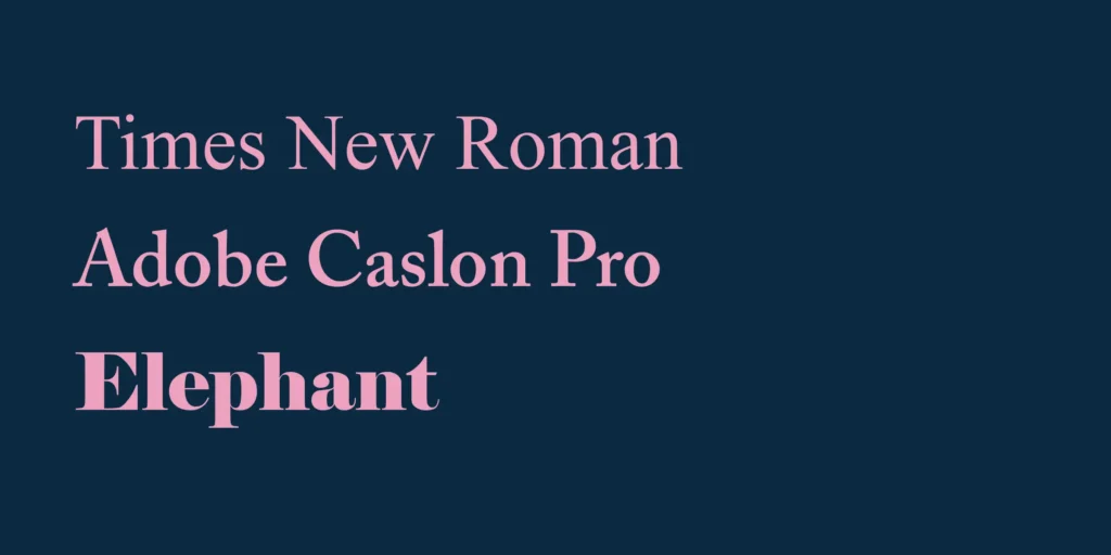
Serif fonts are recognised by the small 'feet' on each letter. They can also vary widely in the thickness of the lines. Serif fonts give a traditional feel and a more formal look. They are ideal for printing in newspapers or magazines as the serifs can help the eye follow the text, making longer texts easier to read.
Different types of Serif fonts
Sans-serif fonts
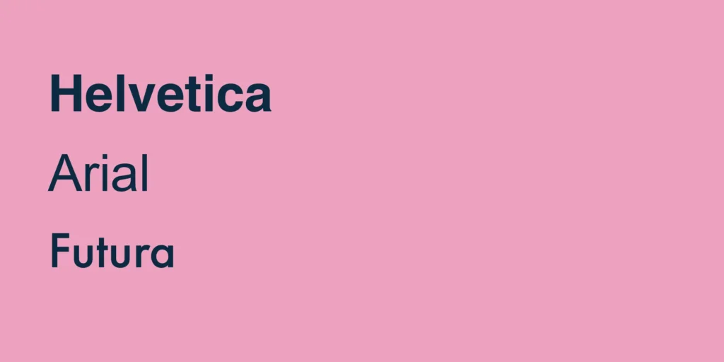
These fonts lack the small "feet" and are perceived as more modern and have a more clean look, making them very readable, especially on screens.
Some of the best-known examples of sans-serif fonts are Helvetica, Arial and Futura. Their simple appearance makes them versatile and popular in a variety of contexts, from logos and signage to websites and digital interfaces. Sans-serif fonts often convey a sense of efficiency, professionalism and modernity.
Other fonts
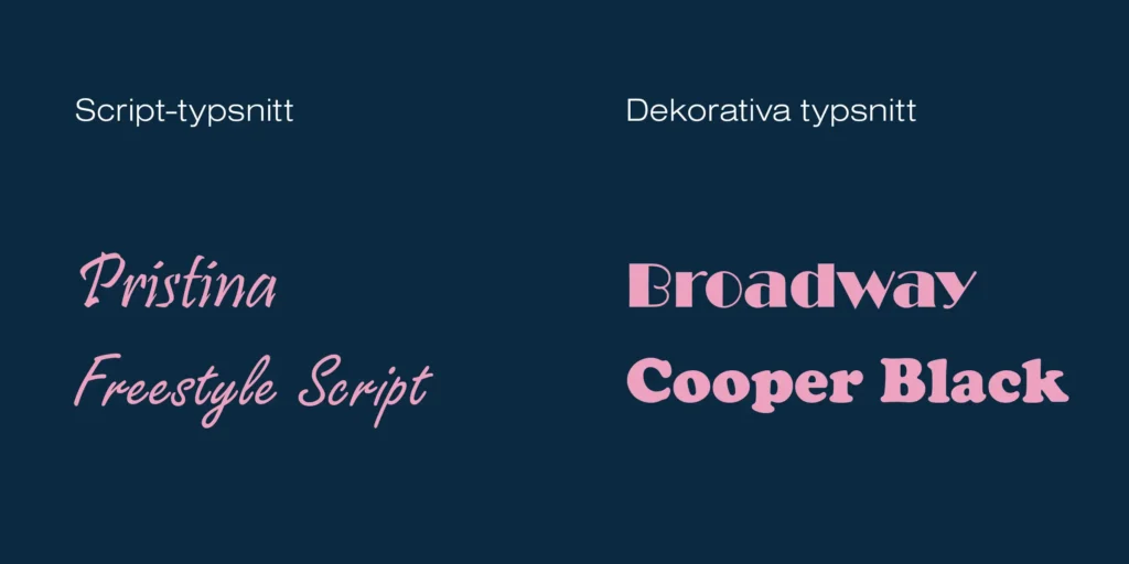
- Script fonts: Designed to create a personalised and unique touch. A script font often has a handwritten style. Often used for various invitations and logos to create a unique look. As they can be difficult to read at smaller sizes, they should rarely be used for longer texts, but work best as accent fonts.
- Decorative: Fonts that are designed to stand out with a unique style. Its primary purpose is to capture the reader and convey a feeling. Often used for large headlines, logos, posters or on packaging to create a strong visual identity.
Where can I find fonts?
There are lots of sites where you can download fonts, both those that are free and those that cost. The free options go a long way, especially Google Fonts with the advantage that it is available on all major website builders (including Elementor and Breakdance Builder). This creates a whole in both print and digital.
To get an even wider range of fonts, you need to pay. Some good options are Adobe Fonts, which is included if you have a Creative Cloud subscription. There are over 30,000 fonts to choose from, so you should be able to find something suitable. Another good option is Envato Elements which, in addition to fonts, offers photos, videos, templates, illustrations, 3D and more, with unlimited downloads.
Fonts (free)
Fonts (cost)
Executive summary
To choose the right typeface for your brand, you first need to have a clear vision of the feeling you want to convey. It is this vision that determines which typeface is best suited to represent your graphic profile.
If you want a classic and elegant look, a serif font is a good choice. If you're aiming to be modern, minimalist and efficient, a sans-serif font might be the right choice. If you want a more personalised and unique feel, a handwritten font might be an interesting option.
We recommend defining what personality you want your brand to have. Brand building is a crucial part of how your brand is perceived by others. Create a clear direction to find the right style and feel to make your brand stand out.
Need help with your brand and branding? Contact us on Digital Partner today.