The right choice of colour can make your brand memorable, build trust and make you stand out from the crowd.
In this blog post, we'll tell you why colour choice is crucial for your logo and brand identity, and how to find the colour that really lasts over time.

Reading time: 3 min
The question may sound simple, but the answer is anything but obvious. Colour is one of the most powerful tools in your brand identity, and the choice of colours in your logo, graphic profile and marketing affects both how you are perceived and the emotions you evoke. Choosing the right colour is not just about aesthetics. It's about psychology, culture and sustainability.
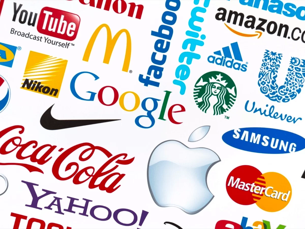
Colour communicates instantly, before we even read a word or understand a logo. Different colours evoke different associations and in a competitive world, it's crucial to stand out while feeling relevant.
Example:
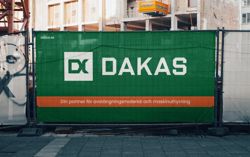
But: if all health brands choose green and all banks choose blue - it will be hard to be seen.
Many businesses get stuck in the safe - but the 'safe' can easily become the boring. If you want to build a brand that really stands out, you need to dare to think beyond the obvious.
Choosing a brand colour can be compared to choosing a colour for your bedroom.
In short: the colour must feel right - every day.
Also, don't forget that colours mean different things in different cultures.
If you want your brand to reach a global audience, it is important to consider cultural differences when choosing colours.
Digital Partner can help you with everything from create a logo that reflects your company's personality to shape your entire brand. Contact us for more information.
Choosing the right colour for your brand or logo is more than an aesthetic decision - it's a strategic investment. With the right choice, you can:
So, the next time you review your logo or graphic profile, ask yourself: Is this a colour I can live with for a long time, and that truly reflects my brand's personality?


Swap the pieces until the puzzle is solved.


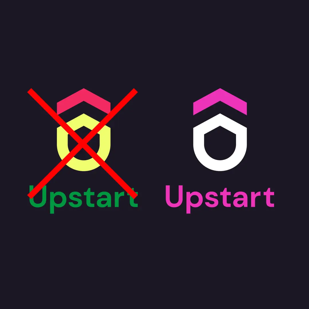
DO THIS:


Swap the pieces until the puzzle is solved.

Swap the pieces until the puzzle is solved.


Get 10% on your first purchase from Profilexperten.se
The offer is valid until 31/12/25.
Create an account at Profilexperten.se to take advantage of the offer!


