


More than just a picture
A logo is not just a decorative image. It is at the heart of your brand and serves as the visual representation of your company online, offline, on products and in marketing. A well-designed logo should be clear, memorable and work in any size and context.
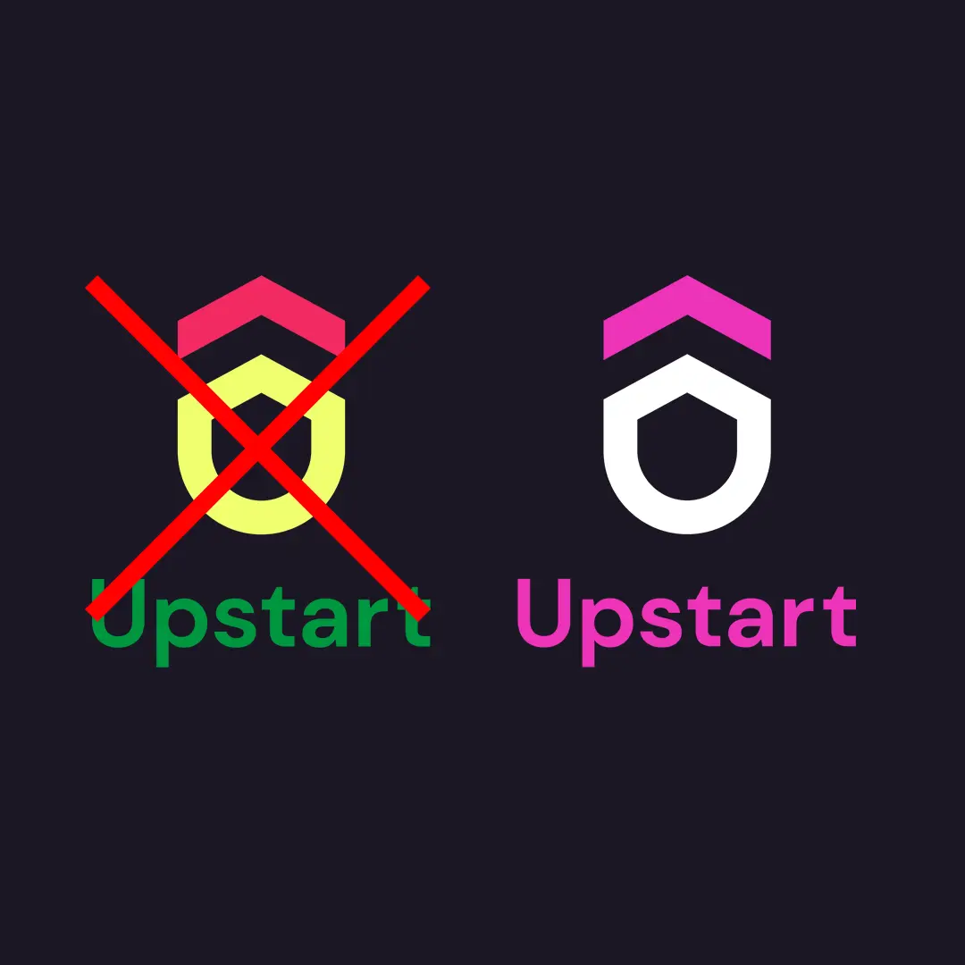
Online use
In today's digital world, it's crucial that logos work well on screens, from smartphones to large computer monitors. A complex logo can lose detail and become illegible when scaled down, while a clear and simple design works at any size.
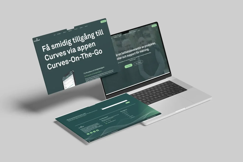
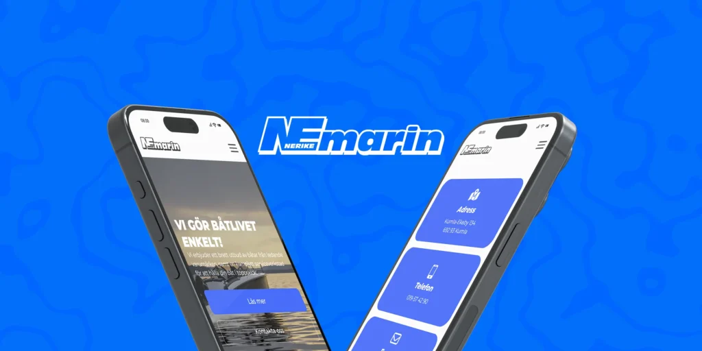
Tips: Always test your logo at small sizes to ensure it is still clear and recognisable. At Digitalpartner, we can help you get a logo in the right formats that work in any situation. Contact us for more information.
Warning about AI-generated logos
AI tools can be fast and cheap, but they have a downside: they often create products that look the same. It's easy to fall into the trap of “blending in” instead of standing out. Your brand needs a unique logo that sets you apart from the competition and creates a visual identity that people remember.
Different types
When creating a logo, there are several styles to choose from:
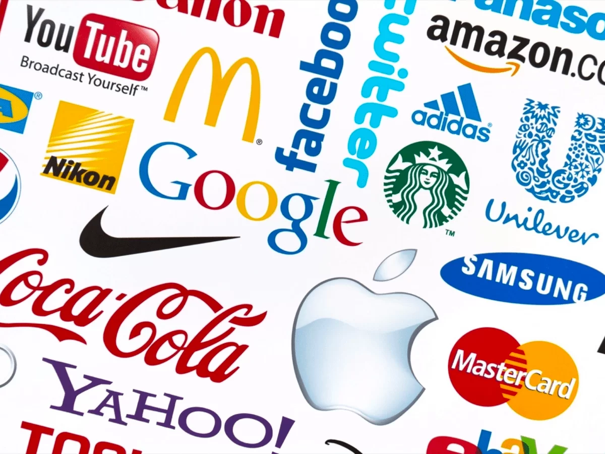
- Wordmark - the company name in a distinctive font, e.g. Google.
- Lettermark - initials are used, e.g. IBM.
- Pictorial - a symbol or icon represents the brand, e.g. Apple.
- Abstract - an abstract symbol that does not directly represent something concrete, e.g. Adidas.
- Emblem - text and symbols are combined within a shape, e.g. Harley-Davidson.
- Mascot - a character represents the brand, e.g. Michelin.
- Combination - a mix of text and symbols, e.g. Burger King.
Hidden messages
Some logos contain subtle details that reinforce the brand message and make them stand out.
- Amazon: The arrow from A to Z symbolises that they sell everything, and the arrow also forms a smile.
- FedEx: A white arrow between E and X indicates forward movement.
- Toblerone: A bear hidden in the mountain represents Bern, Switzerland, where the chocolate comes from.
Hidden messages make them more interesting and memorable, but they should be subtle and not interfere with readability.


The simplification trend
Many well-known logos have been simplified over the years. The trend is towards the flat, simple and modern that works well digitally:
- Apple: From detailed apple illustration to simple silhouette.
- Coca-Cola: Retains the same typography, but has modernised the lines and colours.
- Volkswagen: From 3D effects to minimalist flat design.
- Microsoft Windows: From multiple colours and shading to a simple square icon.
Simplification makes them more timeless, easy to recognise and functional on all platforms.

Cost: It doesn't have to be expensive
A logo doesn't always have to be designed from scratch. Sometimes an update or subtle change is enough to modernise and improve recognition. The important thing is that it is consistently used and works with the whole graphic profile.
More than just a logo
A logo works best as part of an overall visual identity. Keep in mind:
- Colour palette
- Typography
- Imagery
- Signs and signposting
- Merchandise and promotional products
Creating a consistent graphic profile reinforces the brand and makes it recognisable on all platforms and in all contexts.
Executive summary
- The logo should be clear, unique and work digitally.
- AI-generated risks looking generic, get out instead!
- Hidden messages and clever symbols make them more memorable.
- Simplification is a trend: simpler works better online.
- The logo is part of a larger graphic profile, the whole is what strengthens the brand.
Do you want to update your logo or create a new one that stands out?
We help you find a logo that works in any context and strengthens your visual identity. Contact us!